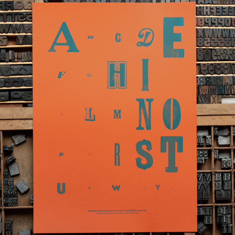
Proportional Alphabet
An alphabet with letters sized by their frequency of use in the English language. This print, originally produced for the opening of Young V&A (formerly Museum of Childhood) where a video of its making is displayed, uses our wooden and metal types to show that some letters are more popular than others – something that letterpress printers know well as being ‘out of sorts’ (running out of a certain letter) when typesetting a text can be a big inconvenience. Set and printed on GF Smith Colourplan ‘Rust’, 135gsm. Edition of 100. Size 297 x 420mm (A3).
AI Readiness
Good foundation, but some important product data is still missing.
72%