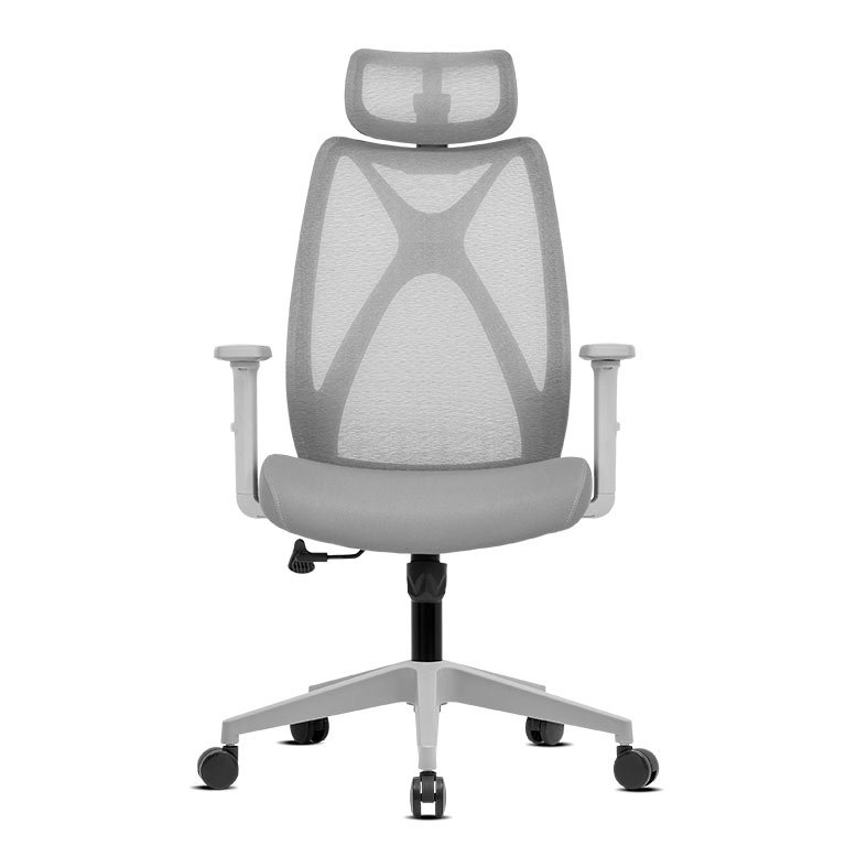
Cadeira Office Zinnia Dax, Braco 2D, Espuma Moldada, Cinza
:root { /* IMAGEM FILETE DESKTOP */ –filete-desktop: url(‘https://hotsite.pichau.com.br/descricao/produtos/filete-cadeira.png’); /* IMAGEM FILETE MOBILE */ –filete-mobile: url(‘https://hotsite.pichau.com.br/descricao/produtos/filete-mobile.png’); /* THUMBNAIL VIDEO 1 */ –thumb-video1: url(‘https://hotsite.pichau.com.br/descricao/videos/zinnia/ZNO-MNTSL-BL03.jpg’); /* THUMBNAIL VIDEO 2 */ –thumb-video2: url(‘https://hotsite.pichau.com.br/descricao/’); /* BANNER IMAGEM DO PRIMEIRO BLOCO */ –banner-principal: url(‘https://hotsite.pichau.com.br/descricao/zinnia/ZNO-DLAS-BK02/1V2.jpg’); /* BANNER IMAGEM DO SEGUNDO BLOCO */ –banner-secundario: url(‘https://hotsite.pichau.com.br/descricao/zinnia/ZNO-DLAS-BK02/2V2.jpg’); –bg1: url(‘https://hotsite.pichau.com.br/descricao/zinnia/ZNO-MNTSL-BL03V3/BG1.webp’); –bg4: linear-gradient(rgba(0, 0, 0, 0.2), rgba(0, 0, 0, 0.2)), url(‘https://hotsite.pichau.com.br/descricao/zinnia/ZNO-MNTSL-BL03V3/BG2.webp’); –bg5: url(‘https://hotsite.pichau.com.br/descricao/zinnia/ZNO-MNTSL-BL03V3/BG3.webp’); –bg6: url(‘https://hotsite.pichau.com.br/descricao/zinnia/ZNO-MNTSL-BL03V3/BG4.webp’); /* linear-gradient(rgba(0, 0, 0, 0.9), rgba(0, 0, 0, 0.9)), */ –cor-letra-branca: #fff; –cor-letra-fundo: #595d61; –cor-letra-black: #000; /* STORIE 1 */ –storie-1: url(‘https://hotsite.pichau.com.br/descricao/zinnia/ZNO-MNTSL-BL03V3/ZNO-FLCSL-BK0218.webp’); /* STORIE 2 */ –storie-2: url(‘https://hotsite.pichau.com.br/descricao/zinnia/ZNO-MNTSL-BL03V3/ZNO-FLCSL-BK0219.webp’); /* STORIE 3 */ –storie-3: url(‘https://hotsite.pichau.com.br/descricao/zinnia/ZNO-MNTSL-BL03V3/ZNO-FLCSL-BK0220.webp’); /* STORIE 4 */ –storie-4: url(‘https://hotsite.pichau.com.br/descricao/zinnia/ZNO-MNTSL-BL03V3/ZNO-FLCSL-BK0221.webp’); } /*——–VIDEO – BANNER——–*/ .thumb-video1 { content: var(–thumb-video1); } .thumb-video2 { content: var(–thumb-video2); } @media (max-width: 839px) { .desktop { display: none; } } @media (min-width: 840px) { .mobile { display: none; } } .filete { border-radius: 15px; width: 100%; } .zoom { transition: transform .2s ease; } .zoom:hover { transform: scale(1.05); } @media (min-width: 840px) { .thumb-video1, .thumb-video2 { width: 100% } .mobile { display: none; } .mobile2 { display: none; } #videos { padding-left: 10em; padding-right: 10em; } .video2img { float: right; } .txt-intro { margin: auto; padding-right: 2em; } .txt-second { margin: auto; padding-right: 2em; } } .previewvideo { opacity: 1; transition-duration: 0.4s; } .previewvideo:hover { opacity: 0.8; } .img-fluid { max-width: 100%; height: auto; display: block; } .filete { border-radius: 15px; width: 100%; } .videosint { align-items: center; } #videos { color: white; background-image: url(“https://hotsite.pichau.com.br/descricao/produtos/bg-videos-4.png”); background-size: cover; background-position: center; background-color: #e90313; border-radius: 15px; padding-top: 20px; padding-bottom: 20px; text-justify: inter-word; } #videos h3 { font-size: 2em; font-weight: bold; line-height: 1em; margin: 8px 0px 8px 0px !important; } #videos p { font-size: 1.2em; } .thumb-video { width: 100%; } /*—————————————-*/ /*–BANNER MONITOR E CADEIRA–*/ .filete-desktop { content: var(–filete-desktop); } .filete-mobile { content: var(–filete-mobile); } @media (max-width: 839px) { .desktop { display: none; } } @media (min-width: 840px) { .mobile { display: none; } } .filete { border-radius: 15px; width: 100%; } /*—————————————-*/ #container-principal { color: var(–cor-letra-branca); background-color: var(–cor-letra-black); border-radius: 15px; font-family: ‘Poppins’, sans-serif; } .tam-p { font-size: 1.2em; } /*———-BG1———-*/ #bg-1 { width: 100%; height: auto; background-image: var(–bg1); background-repeat: no-repeat; background-position: center; background-size: cover; border-radius: 15px 15px 0 0; } .container-bg1 { display: flex; align-items: center; padding: 6rem 2rem 4rem 2rem; } .asset1-bg1 { display: flex; justify-content: center; align-items: center; } .asset2-bg1 { display: flex; justify-content: center; } .asset1-bg1 img { max-width: 100%; } .asset2-bg1 img { max-width: 100%; } @media screen and (max-width: 839px) { .container-bg1 { gap: 2rem; } .asset1-bg1 { display: flex; justify-content: center; align-items: center; } .asset2-bg1 { display: flex; justify-content: center; align-items: center; } } /*———-BG2———-*/ .title-bg2 { display: flex; flex-direction: column; text-align: center; padding: 2rem; } .title-bg2 h3 { font-weight: bold; color: var(–cor-letra-fundo); } @media screen and (max-width: 479px) { .title-bg2 { padding: 0rem; } .title-bg2 h3 { font-size: 2rem; } } /*———-BG3———-*/ #bg-3 { background-color: var(–cor-letra-fundo); margin-bottom: -1rem; } .container-bg3 { display: flex; align-items: baseline; justify-content: center; flex-direction: row; padding: 1rem; } .spec1-bg3 { display: flex; align-items: center; flex-direction: column; gap: 2rem; padding: 1rem; } .spec1-bg3 p { text-align: center; } .spec2-bg3 { display: flex; align-items: center; flex-direction: column; gap: 2rem; padding: 1rem; } .spec2-bg3 p { text-align: center; } .spec3-bg3 { display: flex; align-items: center; flex-direction: column; gap: 2rem; padding: 1rem; } .spec3-bg3 p { text-align: center; } .spec4-bg3 { display: flex; align-items: center; flex-direction: column; gap: 2rem; padding: 1rem; } .spec4-bg3 p { text-align: center; } @media screen and (max-width: 479px) { .container-bg3 { padding: 1rem; } } /*——BG4-Bonus—–*/ #bg-4-bonus { background-image: var(–bg4); } .container-bg3-1 { display: flex; } .logo-zinnia { display: flex; align-items: center; justify-content: center; padding: 1rem; } .container-bg3-3 { display: flex; justify-content: center; align-items: center; flex-direction: column; } .p-bg3 { text-align: justify; max-width: 80%; font-size: 1.2em; } .acabamento-bg3 { font-size: 5rem; font-weight: bold; color: var(–cor-letra-branca); } .stories-bg3 { display: flex; gap: 1.4rem; } .stories-bg31:hover { background-blend-mode: multiply; transition: all 1s; opacity: .6; transition: 0.5s ease-out; } .stories-bg32:hover { background-blend-mode: multiply; transition: all 1s; opacity: .6; transition: 0.5s ease-out; } .stories-bg33:hover { background-blend-mode: multiply; transition: all 1s; opacity: .6; transition: 0.5s ease-out; } .stories-bg34:hover { background-blend-mode: multiply; transition: all 1s; opacity: .6; transition: 0.5s ease-out; } .stories-bg3 img { max-width: 20%; } .asset-bg3 img { max-width: 100%; transform: translateY(-0.5rem); } @media screen and (max-width: 1024px) { .acabamento-bg3 { font-size: 4rem; } .p-bg3 { max-width: 100%; } .stories-bg3 { justify-content: center; } } @media screen and (max-width: 840px) { .container-bg3 { display: flex; justify-content: center; align-items: center; flex-direction: column; padding: 2rem; } .acabamento-bg3 { text-align: center; } .p-bg3 { text-align: center; } } @media screen and (max-width: 500px) { .acabamento-bg3 { font-size: 3rem; } .p-bg3 { max-width: 100%; } .stories-bg3 { justify-content: center; } .stories-bg3 img { max-width: 40%; } .container-bg3-1 { display: flex; flex-direction: column; align-items: center; } } @media screen and (max-width: 355px) { .acabamento-bg3 { font-size: 2rem; } } /*——BG4—–*/ #bg-4 { width: 100%; height: auto; background-image: var(–bg5); background-repeat: no-repeat; background-position: center; background-size: cover; } .texto-principal { align-items: center; justify-content: center; } .peso-bg4 { font-weight: bold; font-size: 2rem; color: #fff; } .asset-cadeira-bg4 { align-items: center; justify-content: center; } .text-bg4 h3 { text-align: center; font-weight: bold; font-size: 4rem; line-height: 4rem; } .text-bg4 img { padding-top: 2rem; } .spec1-bg4 { display: flex; align-items: center; gap: 1rem; } .spec2-bg4 { display: flex; flex-direction: column; align-items: center; text-align: center; gap: 1rem; } .spec2-bg4 img { max-width: 60%; } .spec3-bg4 { display: flex; flex-direction: column; align-items: center; text-align: center; gap: 1rem; } .spec3-bg4 img { max-width: 60%; padding-top: 1rem; } .spec4-bg4 { display: flex; flex-direction: column; align-items: center; text-align: center; gap: 1rem; } .spec4-bg4 img { padding-top: 6rem; } .spec5-bg4 { display: flex; flex-direction: column; align-items: center; text-align: center; gap: 1rem; } .spec5-bg4 img { padding-top: 2rem; } @media screen and (max-width: 840px) { .spec5-bg4 img { padding-top: 0; } .spec4-bg4 img { padding-top: 6rem; } .text-bg4 h3 { font-size: 2.5rem; line-height: normal; } } @media screen and (max-width: 500px) { .spec1-bg4 { flex-direction: column; text-align: center; } .spec4-bg4 img { padding-top: 0; } .desc1-bg4 { display: flex; flex-direction: column; gap: 1rem; } } /*———-BG5———-*/ #bg-5 { width: 100%; height: auto; background-repeat: no-repeat; background-position: center; background-size: cover; margin-top: -1rem; } .container-bg5 { display: flex; flex-direction: row; } .specs, .specs2 { display: flex; align-items: center; justify-content: center; padding: 2rem; gap: 2rem; flex-direction: column; } .cadeira { display: flex; align-items: center; justify-content: center; transform: translateY(-0.5rem); } .spec2-bg5 { display: flex; flex-direction: row; align-items: center; justify-content: center; padding: 2rem; gap: 2rem; } .desc1 { display: flex; align-items: center; justify-content: center; flex-direction: column; } .spec1-bg5 img { transform: translateY(2rem); } /*—————–STORIE——————–*/ .design { display: flex; justify-content: center; padding: 2rem; } .design img { max-width: 100%; } .icons-storie { display: flex; justify-content: center; gap: 4rem; } .icons { max-width: 100%; } @media screen and (max-width: 1293px) { .icons-storie { gap: 2rem; } } @media screen and (max-width: 500px) { .container-bg2 { padding: 1rem; } } #storie { width: 100%; margin: 0 auto; /* -webkit-mask-image: -webkit-gradient(linear, left bottom, left top, from(rgba(0, 0, 0, 1)), to(rgba(0, 0, 0, 0))); */ } #storie>div { display: flex; justify-content: center; padding: 0 4rem 4rem 4rem; } .logo-storie { display: flex; justify-content: center; align-items: center; padding: 1rem; } .storie-inside { background-color: red; background-image: var(–storie-1); background-size: cover; background-repeat: no-repeat; background-position: center; border-radius: 150px; transition: 0.5s ease-out; } .storie-inside:hover { background-blend-mode: multiply; transition: all 1s; opacity: .6; } .storie-inside2 { background-color: red; background-image: var(–storie-2); background-size: cover; background-repeat: no-repeat; background-position: center; border-radius: 150px; transition: 0.5s ease-out; } .storie-inside2:hover { background-blend-mode: multiply; transition: all 1s; opacity: .6; } .storie-inside3 { background-color: red; background-image: var(–storie-3); background-size: cover; background-repeat: no-repeat; background-position: center; border-radius: 150px; transition: 0.5s ease-out; } .storie-inside3:hover { background-blend-mode: multiply; transition: all 1s; opacity: .6; } .storie-inside4 { background-color: red; background-image: var(–storie-4); background-size: cover; background-repeat: no-repeat; background-position: center; border-radius: 150px; transition: 0.5s ease-out; } .storie-inside4:hover { background-blend-mode: multiply; transition: all 1s; opacity: .6; } @media (max-width: 839px) { .storie-inside, .storie-inside2, .storie-inside3, .storie-inside4 { padding-top: 20em; } } @media (min-width: 840px) { .thumb-video1, .thumb-video2 { width: 100% } .adapt { margin: 0px -16px 0px -16px; } .storie-inside, .storie-inside2, .storie-inside3, .storie-inside4 { padding-top: 40em; } } @media (max-width: 500px) { #storie>div { gap: 0; padding: 1rem; } } #footer { width: 100%; height: auto; background-repeat: no-repeat; background-position: center; background-size: cover; padding: 2rem; margin-top: -1rem; } #footer2 { background-image: var(–bg6); width: 100%; height: auto; background-repeat: no-repeat; background-position: center; background-size: cover; border-radius: 0px 0px 15px 15px; margin-top: -1rem; } .principal { display: flex; align-items: center; justify-content: center; padding: 2rem; gap: 2rem; } .specs-principal, .specs-principal2 { display: flex; justify-content: center; align-items: center; width: 100%; } .specs-principal img { transform: translateY(2rem); max-width: 100%; } @media (max-width: 500px) { .specs-principal img { transform: translateY(3rem); } } @media (max-width: 839px) { .specs-principal img { transform: translateY(2rem); } } Cadeira Office Zinnia Montreal SL Inspirada pelas belas paisagens da cidade de Montreal, capital do Canadá, a Zinnia traz uma cadeira que completa sua rotina. A Cadeira Office Zinnia Montreal SL foi desenvolvida tendo em mente a priorização da ergonomia e bem estar para o usuário. Contribuindo para uma postura correta, ela evita dores nas costas e ombros graças a sua estrutura planejada para entregar total conforto durante horas e horas de uso. Estuda ou trabalhe sem sentir desconforto ou cansaço. Conforto A cadeira conta com apoio de cabeça, encosto reclinável e assento com malha respirável. A ausência de espuma é compensada pela tensão equilibrada do mesh, que proporciona conforto prolongado sem acúmulo de calor. Qualidade Com estrutura em plástico resistente, malha de alta durabilidade e componentes de boa qualidade, a Montreal foi feita para durar. Mecanismo Equipada com um mecanismo reclinável especial, a Zinnia Montreal SL permite liberdade de movimentos com controle total da postura. Ideal para alternar entre foco e relaxamento com facilidade. DIA A DIA Uma cadeira confortável e ergonômica é fundamental para o uso cotidiano. A Cadeira Office Zinnia Montreal SL foi projetada para ser sua melhor aliada, tanto em casa quanto no trabalho. Base Com estrutura metálica de alta resistência, a base da Zinnia Montreal SL oferece total estabilidade e durabilidade, mesmo sob uso intenso. Seu design moderno com acabamento cromado reforça o visual profissional e robusto da cadeira. Rodinhas As rodas silenciosas com tecnologia soundproof deslizam suavemente sem ruídos ou arranhões no piso. Perfeitas para ambientes que exigem discrição e mobilidade eficiente. Pistão O pistão a gás classe 4 garante elevação suave, segura e com alta capacidade de carga. É o tipo de componente que só se encontra em cadeiras profissionais de alto desempenho. Assento A Montreal SL prioriza a postura do usuário com seu encosto reclinável, apoio lombar pronunciado e braços com ajustes em 4 direções (altura, ângulo, profundidade e largura). Tudo para garantir conforto em qualquer posição de uso.
Specifications
- Categoria
- Cadeiras de Escritório, Lançamentos
- Cores
- Preto
- Tipo de Braço
- 2D
How AI sees this product
The more complete this product's details, the more confidently AI assistants can understand and recommend it.